There is Now a Literal Map of Brooklyn’s Gentrification
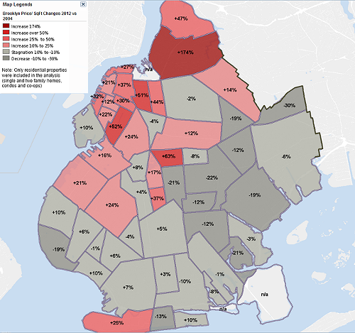
Because sometimes it’s fun to actually have hard data behind the things we believe to be true, Property Shark has created a detailed, neighborhood-by-neighborhood map of property values (and thus, gentrification patterns) in Brooklyn. The results, while largely what you’d probably already guessed, are nonetheless pretty staggering.
As Atlantic Cities points out, property values are spiking pretty much where you’d expect them to — Gowanus and Prospects Lefferts Gardens are in higher demand, and ridiculous fucking Williamsburg is now a ridiculous fucking 174 percent more expensive than it was less than a decade ago. Which is totally preposterous, and certainly scary for anyone looking to move to or just not get priced out of these neighborhoods, but again, pretty much what we all knew was going on in the first place.
What’s a bit more startling is just how uneven this pattern really is, given that prices in the actual majority of the borough, and particularly neighborhoods like Brownsville and East Flatbush, are remaining largely stagnant and even dropping.
Click through to Property Shark for an enlarged, interactive reminder of the fact that you might not be able to afford your apartment that much longer. That, and that any given trend piece talking about say, the “Brooklyn Look,” is referring to probably less than a third of this enormous place we live in.
Follow Virginia K. Smith on Twitter @vksmith.
You might also like 


